Mastodon

24.4.24

A day trip for some reference photos

Parola Armour museum

During the summer half of 2023 the Parola tank museum had a special showpiece, a King Tiger that was on loan from the Bovington's museum. I tried to ask a couple of friends in separate cases if any of them were interested in a silly trip but no one had a matching schedule with mine. So I took this day trip all by myself, especially the Project Assistants I nor II, not to mention my partner, were interested in admiring blocks of steel in engine oil -smelling halls.

On an evilly early Saturday morning in August I drove north to Parola and the parking lot was jam-packed already thirty minutes after the opening of the museum. Following that the first hall that was the King Tiger's temporary home was also pretty damn busy. I had dragged our DSLR camera with me, so I took only a few photos with either of my cell phones, because the big one was much better for references?

What happened with my numerous photos was that I moved them on my desktop, but delayed with my actual backups a bit too long and an OS update wiped my data drive along with the OS-dedicated drive. My recovery attempts were futile and I was a bit annoyed with myself and the OS provider. These tank photos were the only ones I hadn't paranoidly copied to many different disks in many places.

Panzerkampfwagen Tiger Ausf. B

The rare display piece was the Henschel's second prototype hull, Versuchs-Fahrgestell No. V2, with the older turret. The tank itself had few extra pieces on it, such as side skirts, mud flaps, tools, or most of the exhaust pipe pieces either. Seeing a Königstiger with my own foul eyes was awe-inspiring and it was extra amusing as the tank was positioned just about next to a tiny Vickers-Armstrong -made tankette that was pretty much the size of a wheel barrow.

The only photo of mine that remained of the biggest of kitties:

ô_õ

More important than photos was that I did get to ogle at the tank myself, at weird angles and just be generally baffled by the immense size of the tank. Just the drive sprockets were about the size of my torso and most likely somewhat heavier as well. It was impressive, if I had to choose one word. Now I just needed to find myself next to a live Tiger, and a Panther would be a cool bonus.

T-34/76 "Sotka", Ps 231-1

I was taking these T-34 photos for reference at a pretty fortunate time, as I hadn't started with the mine roller tank yet, but I knew I was going to take it up soon after. I was most excited to check the wear and tear on the tracks and what looked worn-out in which place.


StuG III Ausf. G, Ps 531-45

More than the many Soviet tanks in the museum I knew I was going to need (and want) more random, weird details on the German tanks. Looking at the effects of the road wheels and such was always useful, to begin with. Had I gotten very deep in this stuff, I might have tried to recognize the type of the tracks on this one, but I didn't know enough to say a thing.

In case I ever was going to make another tank with a modeled interior, and especially a StuG, it was a good idea to link to Andreas Lärka's collection here: http://www.andreaslarka.net/ps531045/ps531045.html


One of the most useful details here was the jack's wooden block and go me for taking a photo of it with the phone as well. I recognized being completely wrong with these pieces on models and had painted them so very wrong for years. These days I knew better.


57 ITPSV SU 57-2, Ps 461-nn

This turreted Sergei (the Finnish name for ZU-23-2, the twin-barreled 23mm AA cannon) on a tank chassis mostly offered me some more fun details of the life-lived tracks, the tow cable loops for upcoming chipping sessions, and the general forest-provided debris on different parts of the tank.


Panzer IV Ausf. J, Ps 221-nn

Of the J-model Panzer IV I didn't take many quick photos of, as it was such a rusty individual that I didn't see myself copying all that myself. For the upcoming projects I was most interested in its muzzle brake.


Some Soviet tracks

These photos I took only because these tracks showed so nicely how the contact surfaces of the tracks reflected light and how the bare metal showed at different angles. I think I spent a good fifteen, twenty minutes with the proper camera and my phone, most likely looking a bit silly, trying to capture the effect I saw so plainly with my own two eyes.


All in all the photos from my trip could've been much worse, these quick "easier to check from the phone than from the computer" shots saved a bit at least. The drive overwrite happened months ago now and I was still heavily annoyed by it.

17.4.24

Finished: I/24

Doomguy Urbie


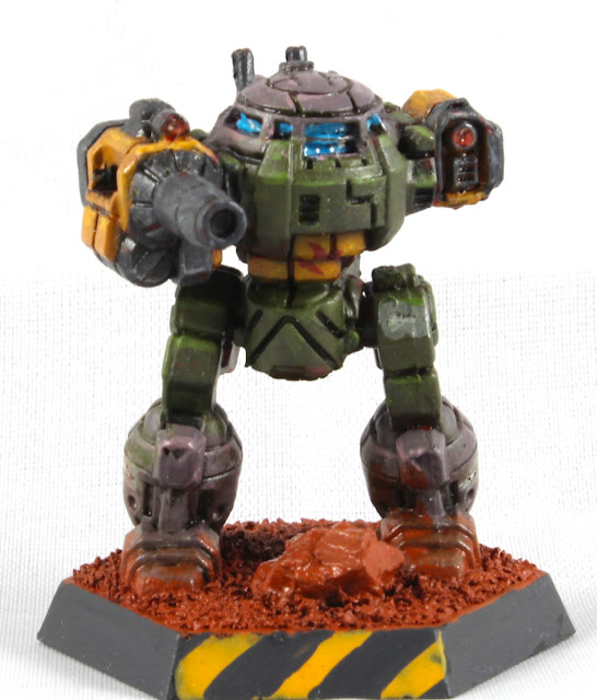
So here it was, Doomguy-Urbie, an UrbanMech painted a bit like Doomguy himself, inspired by Eldoniusrex's artwork but without the horde of Barons of Hell, bright green splatter on the ground, or the guy running to help you in the distance. Not too many people would make this connection without being pointed to it, I felt, but such was life. Of course I forgot to even think of doing the ripped fabric and wounds on the inner right thigh for the Urbie but that kind of a detail could've been completely lost even if I tried to copy it.
Union Aerospace Corporation

Like I said while pondering on the paint scheme, the Union Aerospace Corporation -conglomerate from Doom (1 and 2) fit inside Battletech's corporate-run neofeodal universe like a glove, so of course UAC also had its own private heavily armed security forces to keep them from relying on Mercs or the benevolence of the armed forces of the Successor States.

While we were speaking of a game which had a few-sentence backstory, there wasn't much official worldbuilding anywhere, as very little of Tom Hall's design document was used in the end. So I decided myself that Doomguy was the perfect incarnation of the UAC scheme, even though I could've used any of the four co-op/deathmatch colours (green, indigo, brown, red) or the former humans' uniforms (zombie, shotgun sarge, minigun-baldie) to draw inspiration from. Or I could've added the blue megaarmor over the green combat overalls! Nothing else fit the cover art, so these ponderings went to /dev/null for this project.

Now that I had one, I could later implement the same or similar pattern on three other Light BattleMechs and have a full lance of corporate goons to fight against the Clans, Mercenaries, and the space AT&T (or whatever was your favourite-hateful teleoperator).

UrbanMech UM-R60

Here we had a thirty-ton light BattleMech, slow as a legless goat in a deep snow bank, whose most exciting feature was the 360° rotating torso. This walking trash can was armed with an Imperator-B Autocannon (AC/10) in its Right Arm, loaded with a ton of ammunition (for 10 shots), and in its left arm it had a Light Laser for those critical "the boss dropped their keys in the rubble" missions. Being a city fighter it at least had Jump Jets, and I imagined the three points of damage threatened into the upper 'Mech brought by a DOA attack were a better threat than nothing.

Photos

Painting this one was fun, the biggest issues I caused myself by using red primer. Spending a bit more time planning the paintable areas and maybe even masking I could've gotten it a tiny bit better, but I was quite happy as it was now.


What went wrong were the tiny grey UAC insignia I painted on the grey areas. Somehow I thought that the cold tones would've stood out like a sore thumb from the warm-tinted tones, but it didn't work that clearly. I ought to have painted black outlines for the logos.

My happiness factor was noticeably increased especially by the laser lenses, that were pretty successful in my opinion. During the last year I've been trying out some different new methods, like the oil paints and lens effects. What insanity or methods I had earlier ignored as being too difficult I should try out next?

todoList.append("buy that damn tripod")

Time wastage

Again, I didn't really follow my time usage this time either, so this was just an estimate of "a couple of handfuls of hours" was used on active project time. I had expected this to be a very quick gig, as the mini was small and the idea was crystal clear from the beginning. The brightness of this idea dimmed a bit when I had to decide which bits were to be which colour, but I just went with my gut feeling as usual. So if I declared that this used about a full workday, I wouldn't at least be underestimating the time spent, maybe I wasn't also underestimating this awfully mcuh, either.

The time spent on gimping the photos or writing up all this nonsense was most definitely not included in the values here, which is what I meant with the active project time 🙃

10.4.24

A trash can on Mars

Martian ground

Of course the Doomguy-themed UrbanMech needed a Doom-themed hex base. I wasn't any kind of a terrain maker, so I didn't have much to use. The crackling ground -type technical paint by Citadel that I have used twice already was hard as a rock so I didn't even need to consider that as an option.

Some folks had said that my Archer's base was neat, and all it had was just some Woodland Scenics' ballast painted with a couple of oil washes. I thought I could do that, but for variety I felt like gluing a piece of rock or two. Had I been more enthusiastic, I could've built a bit of a non-flat ground shape with acrylic muds or consecutive layers of white glue.

Gravel piece

There was a ridiculous amount of gravel that got carried home in the shoes during the slippery winter. A couple of those pieces had hidden into the corner of the airlock, and why would I go outside to look for stones if I didn't actually need to go outside for stones? I tried out three pieces, and I superglued the smallest of the lot just below the UrbanMech's proverbial nose.

Yes, the gravel piece was enormous!

Glue and ballast

This was a simple approach for a simple person: I covered the hex base with white glue. Then I poured a healthy amount of ballast over the wet glue. Excesses were shaken back into the weathering box (IIRC it was a Basilisk's box, based on the size and the Imperial Aquila). A good while later I brushed off the excess crap from the Urbie's feet, the rest waited for the glue to cure.

Instead of individual pics I just gimped my doings into a non-moving montage.

That was that, I left the miniature in its box overnight so it had time to think of what it had done. The next evening I was looking for red paints, thought that maybe I could do this with oil washes like the last time. The main colour could be the brick red, then one or two other paints blended in. I didn't want to make this too complicated or colourful, that was a recipe for bleeding eyes.

Marsification with paints

Before starting I spent even more time thinking of my paints. Ultimately I settled with the "not too many" and took my three unused oil paints to be tested. The rusts I was going to skip now, maybe completely.

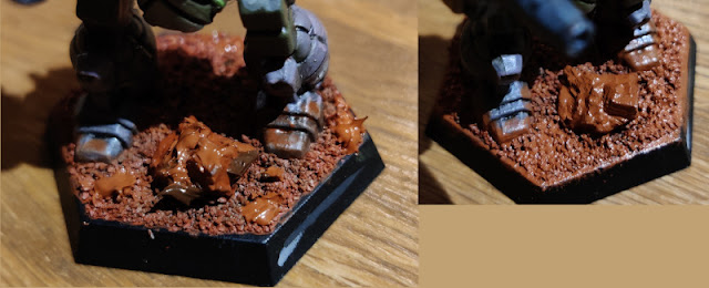
For the ground painting I made a thinnish wash with each of these paints. Like planned, I started with the Dark Brick Red (ABT220) that was a bit darker than I expected, at least when wet. See the first frame of the tetraptych below.

Without wasting time I added the new rustlike paint (ABT260 Oxide Patina) to highlight some of the more light-touched parts like the edge areas of the hex base and the top parts of the rock. This was, obviously, visible in the second frame.

Then I almost changed my mind with the earthy one (ABT090 Industrial Earth) but ended up using it mostly for making up shadows, under the edges of the rock and generally under the UrbanMech itself. Finally I spread some of my oil washes onto the Urbie's feet with the blending brush. The still wet result was shown in the last two frames.


The next day I checked the look between some meetings. The sun was shining, so the lighting conditions were noticeably different compared to the previous evening's.


It was quite red, this Mars ground of mine, but not flat, so I fel that there was some method to my madness. Perhaps the rock itself could benefit from some other kind of red-ish tone, so I was thinking of digging out the rust paint. Maybe the light rust, so the rock would look clearly different.

Rust rust rust rust

Well, I didn't think long, I just doublechecked the Marsiness feeling from my partner and their judment was "too red" as well. I applied a few spots of Dark Rust (ABT070) to shadowed areas, and light rust (ABT060) to the better-lit areas. I blended them around with my round brush and left the setup to dry once again.

It felt better this way. The ground-dirtied effect on the feet might require some bringing down, or I'd just look from further afar the next day to decide if that was needed.


It worked just fine.

And the sides of the hex base

To wrap the basing business up I painted the edges with German Dark Grey. The front edge, marked by where the Center Torso was looking, I decided to mark with caution stripes. Had I got some actual skills in me, I'd tried to implement something from Doom's textures, but as I wasn't skilled, I wasn't going to try anything that mad.

The caution stripes (or hazard stripes) I painted by first covering the full edge with yellow ochre, and when that had dried, I painted the angled stripes with dark grey. This way I guaranteed that the caution stripe existed only in the front sector.

While I remembered, I covered a couple of the bits showing hull red in front of the AC/10's targeting laser with yellow ochre, as those only showed in the photos and I truly had difficulties in spotting them with my own eyes from the mini itself. And as I was fixing the last things that annoyed me in the photos, I also mixed a bit of red-tinted stonewall grey and painted over some blue overflow from the double viewport in the front of the Urbie's head. The new mix wasn't an exact match with the previous highlight tone, but it worked better than the electric blue.

Finally I needed some gloss varnish (Vallejo 70510) on the lenses and the viewports. On the laser lenses I used two drops with a day of curing time between layers, the viewports only got a single coating because they wouldn't have benefited from a convex surface.

Ultimately I decided to pull down the Marsiness of the feet a bit. Now it was good enough for my liking.

Now the UrbanMech felt like it was completed, at long last. This had taken a surprisingly long time, especially if you compared the project time to the Archer. This was a much smaller miniature, a lot weirded painting scheme (and my own weird layering ideas) and a couple of silly mistakes like the colour temperatures between cold and warm tones.