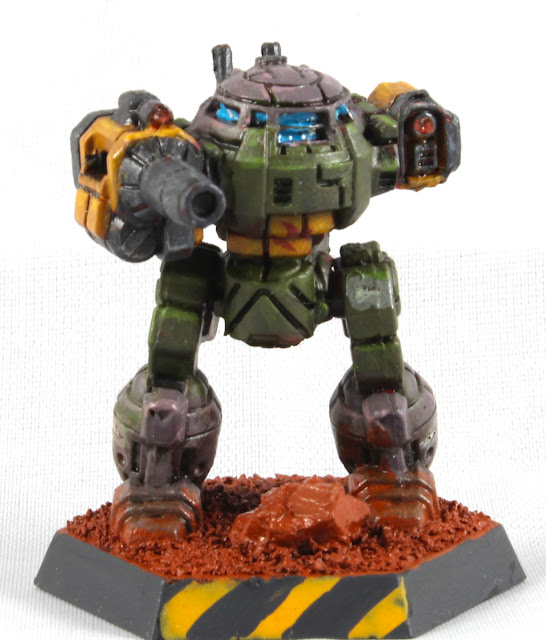
Doomguy Urbie
So here it was, Doomguy-Urbie, an UrbanMech painted a bit like Doomguy himself, inspired by Eldoniusrex's artwork but without the horde of Barons of Hell, bright green splatter on the ground, or the guy running to help you in the distance. Not too many people would make this connection without being pointed to it, I felt, but such was life. Of course I forgot to even think of doing the ripped fabric and wounds on the inner right thigh for the Urbie but that kind of a detail could've been completely lost even if I tried to copy it.
Union Aerospace Corporation
Like I said while pondering on the paint scheme, the Union Aerospace Corporation -conglomerate from Doom (1 and 2) fit inside Battletech's corporate-run neofeodal universe like a glove, so of course UAC also had its own private heavily armed security forces to keep them from relying on Mercs or the benevolence of the armed forces of the Successor States.
While we were speaking of a game which had a few-sentence backstory, there wasn't much official worldbuilding anywhere, as very little of Tom Hall's design document was used in the end. So I decided myself that Doomguy was the perfect incarnation of the UAC scheme, even though I could've used any of the four co-op/deathmatch colours (green, indigo, brown, red) or the former humans' uniforms (zombie, shotgun sarge, minigun-baldie) to draw inspiration from. Or I could've added the blue megaarmor over the green combat overalls! Nothing else fit the cover art, so these ponderings went to /dev/null for this project.
Now that I had one, I could later implement the same or similar pattern on three other Light BattleMechs and have a full lance of corporate goons to fight against the Clans, Mercenaries, and the space AT&T (or whatever was your favourite-hateful teleoperator).
UrbanMech UM-R60
Here we had a thirty-ton light BattleMech, slow as a legless goat in a deep snow bank, whose most exciting feature was the 360° rotating torso. This walking trash can was armed with an Imperator-B Autocannon (AC/10) in its Right Arm, loaded with a ton of ammunition (for 10 shots), and in its left arm it had a Light Laser for those critical "the boss dropped their keys in the rubble" missions. Being a city fighter it at least had Jump Jets, and I imagined the three points of damage threatened into the upper 'Mech brought by a DOA attack were a better threat than nothing.
Photos
Painting this one was fun, the biggest issues I caused myself by using red primer. Spending a bit more time planning the paintable areas and maybe even masking I could've gotten it a tiny bit better, but I was quite happy as it was now.
What went wrong were the tiny grey UAC insignia I painted on the grey areas. Somehow I thought that the cold tones would've stood out like a sore thumb from the warm-tinted tones, but it didn't work that clearly. I ought to have painted black outlines for the logos.
My happiness factor was noticeably increased especially by the laser lenses, that were pretty successful in my opinion. During the last year I've been trying out some different new methods, like the oil paints and lens effects. What insanity or methods I had earlier ignored as being too difficult I should try out next?
todoList.append("buy that damn tripod")
Time wastage
Again, I didn't really follow my time usage this time either, so this was just an estimate of "a couple of handfuls of hours" was used on active project time. I had expected this to be a very quick gig, as the mini was small and the idea was crystal clear from the beginning. The brightness of this idea dimmed a bit when I had to decide which bits were to be which colour, but I just went with my gut feeling as usual. So if I declared that this used about a full workday, I wouldn't at least be underestimating the time spent, maybe I wasn't also underestimating this awfully mcuh, either.
The time spent on gimping the photos or writing up all this nonsense was most definitely not included in the values here, which is what I meant with the active project time 🙃


No comments:
Post a Comment