Mastodon

20.7.22

Disgusting bases for the default Star

Finalization rounds

My fifteen accomplished Warriors in their equipment were just about done now. Only their surroundings were missing from the photos, the black hex bases were supremely boring and all the previous ones were either sand-based or watery (or a mix of those). Now that I had a set of fresh and nasty mud types I had to put them to good use.

Icky icky goo for the legs

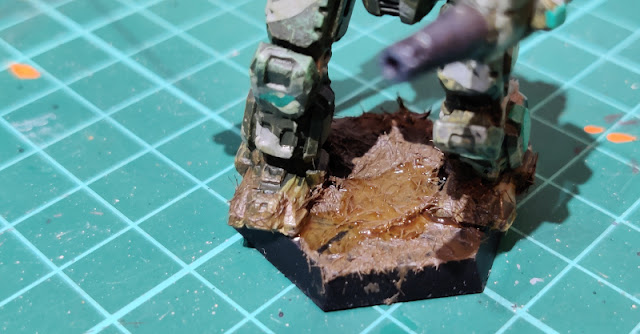
For starters I just made a decent mess on the bases and the feet of the 'Mechs, using my arsenal of crap. Euromud (VWE:Thick Mud 73807 European Mud) provided the first layer in pretty silly amounts. The bits that didn't get covered with the euromud got topped up with some black mud (VWE:Thick mud 73812 Black Mud), with the edges mixed and messed a bit to prevent it looking too planned and artificial.

After these main layers I used here and there some mud-grass glop (VWE:Environment 73826 Mud and Grass). My partner was looking at this from the side and said that they honestly looked disguting. I took that as high praise in this context.


The way my poor elementals were trodding in waste was looking really, really unpleasant. Luckily they were wearing Power Armour anyway, unlike traditional ground troops.


An attempt at the heat effect

Over the years I have encountered a couple of articles and picture series of how to achieve a decent-looking heat-ruined metal surface. Mostly these have been about exhaust pipes and whatnot. I thought that the boring and uninteresting Executioner would be fruitful ground for a test that could always be overpainted again, if needed.

For this attempt I used the Citadel washes I had bought a good bunch of years, one of which I had put into such a good place that I couldn't even find it anymore, so I didn't use the full possible array. What I did was to generally follow the example: first I washed almost the full barrel's lenght with sepia (Citadel Shade: Seraphim Sepia); then starting from the business end, working on a shorter length, I mixed in some violet (Citadel Shade. Druchii Violet); and finally the shortest length got some sort of blue (Citadel Shade: Drakenhof Nightshade).

Time was of the essence, so that they colour layers didn't dry up while I was working on the Gauss cannon. I mixed the washes around the layer edges, but pretty gently as I didn't want the whole barrel to be just covered in some undescribable mess. This effect wasn't very trong, but I also wasn't looking for anything comic-like and bright.


Add some muddy water

When my mud effects had cured I wanted to add a bit more to their nastiness. Each of the bases got some randomly sized and -shaped puddles of Vallejo's acrylic water (Vallejo Water Texture: 26235 Still Water) and when that had cured in turn I used some water texture (Vallejo Water Texture: 26591 Transparent Water) on the puddle edges. This step could've or maybe even should've been done in the reverse order. Didn't look wrong this way, either.


13.7.22

Finished: Project III/22

Optimus Prime

As I may have mentioned a bunch of times before, I've never really been much for cheering for the good guys in stories. Instead, I've been in the "the baddies make the stories more interesting" school of thought  since I was a young boy. Of course there have been and will be exceptions, one of the most visible exception to this rule was Optimus Prime himself.

There wasn't much good I had to say about the eighties, but the original Transformers were most definitely on the positive side of the equation. In addition to SID music and such, of course.

Around around we go

 First the traditional stiff posing photos from different angles. Enjoy:


Poor Legoptimus had a bit of a non-photogenic backside as it was, so I made him wield his jetpack. That didn't help with the buttocks or the rear plates of the arms, but at least it covered the head's hideout.


Accessorizing

Just standing around was a bit obring so I took a couple of photos with the Ion Blaster as well.


"I want *you* to join the Autobots!"

His arms/hands didn't quite rotate in enough to get him to open the chest box himself. With these joints him holding out the Autobot Matrix of Leadership didn't look the most convincing I've seen so far.


Freightliner Fl86 

Prime's alt mode in Earth was a Freightliner Fl86 truck, a cab over engine type of a truck, that is. I managed to miss that a loose 2x1 piece was left on top of the roof for the first two photos.


Fighting with Megatron

Of course I took photos of Optimus with my MP-36 Megatron! Now that I finally got to stage both the duel on the Sherman Dam from the pilot episode's second part (More than Meets the Eye, pt.2) and Megatron's jubilant moment from Transformers the Movie (1986).


Naturally they had to bicker over an Energon Cube, because that's pretty much all Megatron did for the first two seasons: energy. I didn't even try to push Soundwave (with or without his minions) into this cramped space.

I would have waited an eternity for this. It's over, Prime.

I'll always retake this photo and again when I finally get to buy myself an MP-44 v3. Of course.


Metal Earth Optimus

Just like all the other obvious and unavoidable photos so far, I just had to set Lego Optimus Prime to stand next to my Metal Earth Models Optimus Prime. Posing as much the same was as possible, because it wouldn't have made any sense otherwise.

 Or did any of my things here make sense, ever, anyway? :p


So, my collection has grown again and into a nice direction. What next?

6.7.22

Numbers for the default Star's Points

Hex bases and gentle edge highlighting

Simplest steps first: I painted the hex bases flat black.

In my previous project I attempted to highlight my King Tiger's edges after the washing, but I realized that using the exact same camouflage colour didn't bring out much in that model (and paints/washes used). This time I tried using different paints altogether: I drybrushed the green corners with a lighter green (VMC 70942 Light Green) and it had a noticeable effect, but nothing to jump out annoyingly. Now I skipped using a lighter grey, for a reason I couldn't remember when typing this stuff up.

While in the process of drybrushing I also applied some trusty dirty brown (VMA 71133 Dirt) on every 'Mech's legs. I concentrated mostly below the knee, again playing it by the ear.


Unique identifiers

Finally I got to talk about the actual main subject of this post, the Point numbers. To prepare all this I started with a very simple Google Sheets workbook, which obviously got immediately out of hand. Those surprised could be counted with the remaining fingers of an alcoholic circular saw operator.


Now that I had a convenient set of tables with all the frame types with their variants, miniature manufacturers and paintjob statuses, I could attach them to the named Stars of the Trinaries in my Cluster (at this point this was just mock data, to see how it worked). This way I could tell how my megaprocess was progressing and what was missing. My old notes about this were most likely on some A4s that had been recycled a decade ago already.

As the photo above showed, I gave the Invasion box's OmniMechs simply the running numbers 201-205 without caring where and how (and if) they would be located into the Cluster.  I had never had any kind of a real plan behind the numbering of the original IWM miniatures, they were done mostly based on my head's unrandom number generator and the actual physical space I had available for number painting.

Black shadows below

My greatest and most noticeable problem with these hand-painted microscale numbers has always been that no matter the tool, my own skill of doing nice and readable tiny numbers has been awful. This wasn't a typical military font. I just made some numbers to provide the shadows, in black, and didn't worry too much about the shapes because they'd be mostly painted over soon.


Light numbers

After the pre-shadows had dried, I painted over them, offset a bit towards top-left (or that's what I tried to do). Earlier I had used even yellow, but most often just white. Now I wanted to tone the contrast down a bit, so I used light grey (VGA 72749 Stonewall Grey), a colour I had always used as a highlight for the cold grey I used for the camouflage itself.


None of these were going to win any beauty prices. The most important thing was that they were readable. Ish.