Mastodon

3.4.24

A laser trash can with windows

Now it was the time to decide if my painting order was good or useless. So far I had left these funky effects last, and hadn't had to suffer from it, so I was confident.

Viewports

Maybe someone who read the post from two weeks ago noticed that I had been looking at the colour wheel, and even read a tiny bit amount of text about the theory behind all that. Not that I was trying to be artistic or to follow a certain direction, this was just out of curiosity and also to find out useful colours.

So, I had looked at the colour wheel with the idea of finding the viewport colour that would stand out nicely but not stupidly from the yellow/green pattern. On the opposing side of yellow and green was some violet/lilac, but that would've required some colour mixing again and I didn't just feel like it. The PPC blue was close enough on the arc (and if I wanted to force it towards red, I could always apply a Druchii Violet wash unless it had followed the Citadel's paint and pot quality of this millennium and dried up completely).


Because there were so many of these tiny vision slits, I didn't stop to take photos between each blue layer. They were also annoyingly narrow, so making the effect was a bit far-fetched with my skills.  In this fantastic triptych above we had a four layer effect: bottommost layer was plain blue (VGC 72023 Electric Blue), then the next layers were aligned top-left with a constantly increasing padding with a paint with a bit more white (VMA 71279 RAL9001 White) mixed in. For this photoset I hadn't yet added the whiteish dot per viewport, as I didn't trust my eyes not being crossed after a surprisingly long stint.

Small Laser and the targeting beamer

The next step was much more pleasant, there was nothing to think about with the Small Laser's lens colour as I had decided my energy weapon colours and was sticking to them. The bigger problem now was, just like earlier. what was I going to do with the lenses that were not weapons? So far I had used the same or lighter reds than with Small Lasers, but for consistency a specific "not a shooter" lens colour would be better. I was thinking of a yellow-orange or violet, but didn't really have a strong gut feeling about any of this.

Nothing sounded like a clear, immediate solution, so I went with a red lens for the not-laser gun as well. The method was exactly the same as before: a red base (VGA 72710 Bloody Red), then a bottom-right -positioned lighter (again toned up with RAL9001) paint, and while I had the space I made another brighter layer and painted in the top left sector of the previous one, as far as I could control my paints in these tiny spaces. As the sugar in my cappucino I also added the whiteish dots to the top left area. From this viewpoint the lasers looked pretty good, even if I said so myself.

Looking at that photo I felt that I had to paint the cannon's bottom black again. Dark grey worked fantastically everywhere else, but it just looked a bit funky when staring straight down the barrel.

I wasn't overflowing with joy with the glowiness of the viewports, but they were tight and that made them damn difficult for my skills. Maybe adding the glow dot would help, I just wasn't sure if I dared to try in the tiny square ones, or would I just fill them with white...

Well, I did dare and while I was at it, I also blackened the bottom of the Autocannon's barrel. Now it was good enough for me.

27.3.24

No oil into the trash can!

There it was, basics were painted, so now it was time to drop all the oil paints and thinners onto the palette.

Panel lines and shadows

My sepia wash was always a bit too thick - or my paintbrush was a bit large. Or my wash would flow better if I actually did the satin/gloss varnishing before, as recommended. I aimed the was into all of the lines, grooves and shadowed places and didn't even think of just slathering the oil wash all around and then remove the excesses. Being this small the mini was a bit difficult to work with sometimes.

As usual, I left the thinner-powered cleanup for the next evening. I purposefully left the ejection port area of the AC/10 a bit crappier than what I might usually have gone for.

That being done I left it to dry for a couple of days, so that the shadows got properly set before my grass green test. If I had to redo the panel lines again, I would do it in the final stages with the other fixes.

My triplet of supposed UAC logos I might still poke by painting the triangle light grey (Stonewall...) to cover up the rubbish results with the masking. If that got done before any other oil work, the result should be tolerable.

Testing the greenery

Looking a few months back, Santa's colleagues brought among other things four Abteilung tubes ([ABT220 Dark Brick Red, ABT260 Oxide Patina, ABT090 Industrial Earth, ABT094 Green Grass]) and the brightish green felt like a good fit on my green parts, if I only knew how to use it properly. Maybe it would work a bit like the buff I used in the previous 'Mechs but more adjusted for the underlying colour. The UrbanMech didn't have a medium laser, so I didn't need to go insane trying to implement a jewel effect with oils at this point in life.

Following my previous methods I poked a few dots of green paint, then blended it around with the round-tipped blending brush. Perhaps it left a gentle green layer, I just couldn't tell quickly with my eyes and without setting some before/after pics next to each other.


Apparently I didn't ruin my earlier washing with this green operation, so I didn't see any need for a second sepia wash round. It was a tiny victory, but a victory nonetheless.

20.3.24

Fine-tuning the trash can's paintjob

Tweakage

Right. First I had to fix the lower legs and the head, because their cold colour didn't work together with the other, warm tones. The cold grey was also a step or two lighter than what I looked for, so I started by squirting some cold grey on my palette stand-in. To that I mixed two drops of German Grey and two drops of red (VMA 71003 Red RLM23). This looked more like what I was looking for already on the old jam jar's lid, so I tried it out on one of the knees right next to a green area. The difference between these two greys on the mini wasn't huge, but the effect on the mini, when comparing two slightly different knees with their surroundings was incredible.

The last time I was pondering a bit if the boots/feet ought to have been toned towards green to follow the sprite's look a bit more, but I didn't want to make this too complicated for myself. So I decided to use the same customized grey on both the legs and the head.

While those were drying I took some black (VMA 71057 Black) to paint the viewports, the bottom of the AC/10 and the lenses of different lasers. After that I highlighted the various valves, vents and whatnots with German Grey to highlight them a bit before the upcoming oil washes.

Highlighting greens

Just to try something out I mixed the soviet-style 3B green with a couple of drops of brighter green (VGA 72730 Goblin Green) and did a stronger edge-based highlighting on the upper, more sun-kissed green surfaces of the mini. Just like I highlighted the Archer's red armour panels with Ferrari Red, but here the effect could've been a bit stronger, even.

The next evening I continued with my highlighting activities with slightly stronger (brighter) colours. First I fixed what mis- or underpainted bits, then painted thin lines along the various edge with yellow ochre.

To emphasize the greens I did similar thin lines on the edges and upper ends of the panels. This time I didn't mix up paints but used the Goblin Green straight from the bottle.

Skin and metal fixes

On the skinny parts I repainted the biggest gaps that I saw with the Vallejo's wood colour, then did some yellow ochre highlights on the upper edges of the panels. Or wherever the light was supposed to mostly hit.

Lastly I fixed a couple of the metallic bits (the nozzles of the Jump Jets, for example) and as a simple detail I painted the cockpit hatch hinge with German Grey. Maybe the dark grey bits could benefit from a similar edge highlighting as the rest of the parts, a cold grey with a drop of red might be just the thing. Skipping the German Grey from that would keep it bright enough, but hopefully not too bright.

Grey boots and the helmet

Again I mixed a new wonder paint: a random squirtful of German Grey got two drops of RLM red mixed in. That ended up being a bit too red, so I added a bit of Stonewall Grey (VGA 72749) into it. Using this mixture I painted some highlights using my bestest of skills (*snicker*).

Perhaps that did something good for the mini. I used this same paint to highlight the german grey bits too, to get their details a bit more visible.

Uniqueness

To avoid this one to suffer the same fate as my previous one (the mine-clearing T-34/76), I decided to add insignia right now, before washes or weatherings. As the paintjob's inspiration came from Doom and some kind of a unit was to be conjured up, I felt it was obvious: Union Aerospace Corporation. That fit the corporate world of BattleTech like a berserk punch into someone's spleen.

These four samples told me what I needed, I had enough freedom for the insignia. I thought I'd implement this with tiny triangle-shaped masking tape pieces and two grey circles. Depending on my feeling at the moment, I'd either do them with one shade or like the blue one in the bottom, using two greys. Attempting to paint the UAC characters wasn't something I thought I could do in this scale, so the corporate logo had to be enough.

For the masking I just cut a tiny triangle-shaped piece off a slice of masking tape. This triangle was about three times too large, so I only used the tip of it. The tiny piece got pressed on a visible place on the top left leg. I decided to try to do smaller ones in the shins, so I cut two tiny triangles from the edges of the original one. There was some cautious optimism here, despite me knowing that my skills at painting freehand circles with paintbrushes were at absolute zero.

In my hubris I thought for a moment if I should paint them in different greys, so I started with cold grey. As the first circle became a shapeless blob I just did a couple of dots next to each other, positioning them over the three masks.

After removing the masking tape pieces I had no cause for celebration, but that was to be expected. I was still disappoinged with my inability to paint these simple, tiny things: especially the top left leg's main one was foul. On the shins the left one was a bit more tolerable. Still, a crappy idea and I shouldn't have tried this in a tiny mini and scale.

Maybe the Urbie could be saved with some oils. The mini wasn't going to be stared at at these distances, the painting mistakes didn't glare at me when looking at the mini in person, but they did stand out shamefully in the closeups.

13.3.24

Painting a trash can

Priming

Like I've done a bunch of times in a row now, I primed the miniature with red primer VSP 70624 Pure Red). This time I didn't feel like setting up the airbrush, so I did this by hand.


For this projectful of posts I decided to tone down the "a pic from the front, another from the rear" photosets in each of the steps by gimping together a set of photos from the same step. This should make the posts a bit better contained and reduce the "I've seen this same pic with tiny changes six times already" effect I've had on occasion,

Choosing a theme

Originally I was a bit lost with what I would actually want to do with this Urbie, it wasn't going to join my Jade Falcon Cluster, and it also didn't have a clear suggestion in the box like last year's Archer. I also hadn't thought of what kind of a theme my yet-to-be-founded Merc unit, so undone work didn't really help here. Somehow the UrbanMech didn't lure me to paint it as a Kell Hound nor some other well-known Merc outfit.

Then I saw once again a pic that some more active social media users had been sharing pretty happily earlier, and that one struck a chord immediately:

(c) Eldoniusrex

Being a bit simple, I didn't want to make a green-grey unit like in the pic above, instead I wanted to celebrate the original Doomguy by keeping his bare arms in the show somehow.


Combat overalls

Thanks to the cats sleeping over my primary paint store, I chose from my dynamic level 1 cache a few bottles of paint. Of course I had no perfect green paint for this, so I had to mix up a new one to get where I wanted to go. To begin with I squirted some Soviet green (VMA 71281 3B Russian Green), and added two droplets of yellow ochre (VMA 71033). This I brushed on the overalls, and in my excitement a bit over the helmet as well.

As you could tell, it was a pretty dark shade of green. For some reason I tried to do some sort of a wet blending here, so I mixed in another drop of yellow and painted smaller surfaces set off upwards inside the first green layer. My idea was to leave the darkest layer as shadows. Finally I realized I had repeated this to get five consecutively brighter layers, leaving me quite a bit of a different shade than where I started from. Here's a couple of pics for those super interested in the progress of the layer-painting approach:


Yes, indeed, the mini was darker than the VGA-coloured corporate space marine. I planned using a bit more of a bright green as highlight when the basic painting was all done.

Bare arms and the sixpack window

Our Doomsday hero had bare upper arms and a pretty strange window in his shirt to show off his wounded abdominal muscles, so that's what I tried to imitate. Luckily the UrbanMech had four armour panels in a very convenient place in the middle of the Center Torso, so this worked nicely despite the Urbie doing a bit of a torso twist.

This trashcan had no actual arms, obviously, so I decided that I was just going to paint some bits in the gun pods attached the Upper Arm Actuators to get some kind of a skin theme going on. To start this I used a very generically named wood (VMA 71077 Wood) to block out the bare skin patches for later paintings. These I intended to highlight somehow, as soon as I had the areas defined first.

Now the downside of the red primer at this stage was that it made my mini look pretty damn weird. A red-yellow-green piece looked like a handful of fruit-flavoured candy, just much more foul-tasting.

Combat boots and the helmet

I thought that my cold grey (VGA 72750 Cold Grey) was just perfectly dark for this stuff, but nope, it most definitely was not. I had painted the legs from the knees down, and the head cupola to decide whether my colour-blocking worked or not.

The business part of the armament, those being the Autocannon (AC/10) and the flashlight's (SLas) tubes and related bits, the antennae, and the knee joints I painted with German Grey (VMA 71052 German Grey). Yeah, I was pleased with this method of marking metallic pieces without using metallic paints.


At this point the warm yellows and greens worked together just nicely, but the aptly named cold grey didn't match with them at all. I had to start reading about colour theory, or something, to find a recipe for a warmer grey to this miniature. Most likely a drop of (dark) red would take me far, but that had to be tested.

Towards the next step

In any case the basic paintjob was going to be as it was. Mostly I wanted to see if my idea made any sense or was it just an ugly mishmash. If we ignored the colour temperatures, I was happy with this scheme. Of course I had many opportunities for ruining it, but I didn't want to worry about that yet.

Setting up the scheme and blocking the colour surfaces took me about two hours in total, next I was going to fine-tune things. Would I get that done in two hours as well? I'd tell you the next time.

6.3.24

Project I/24

A trash can

I had those three untouched Salvage boxes from the Clan kickstarter, I now was flitting between the UrbanMech and the Mongrel/Grendel A. This time the UrbanMech won, because it could be done straight out of the box.

That's all that was to it. When I had the time, I'd clean up whatever bothered me and then the thing would get primed as always. It might get gently customized by adding whip-antennas.


28.2.24

Finished: IV/23

T-34/76 PT-34 mine clearing tank OOB

The model I started in the very late '23 was now complete, a few calendar months later. This time I used a yet another approach to documenting my process so each of the ten posts covered a very varying amount of real time.

Based on the filenames of my photos I had taken 198 work in progress photos to be edited, divided under 8 themes (and posts). I had no way to calculate the amount of actual time used, all I knew was that the hour count had to be enormous, as one post alone usually covered the happenings of a handful of sessions. Finally, I took 15 photos in the light tent with the final model, and editing those took a moment as well.

It could've gone better

This world would be a weird place, if everything went perfectly and nothing needed (or allowed) grumbling after the fact. Of course this project left something to desire, and that was a good thing because it gave myself some feedback for improvements.

PT-34

The mine roller device with its instructions. I was somewhat confused by the instruction sheet at some points while building, and as I wasn't familiar with the way these things worked (or how they'd looked like in real life) I had no real way to trust my own instict. Now the roller discs didn't end up standing straight like I had visualized based on my own expectations, the relatives in the Parola Armored Museum, and the box art.

If I was a diorama person, and I might be one if I had the space for storing such constructs,  I could've cheated by smashing the rollers into the position I wanted with the base. Floating freely it looked a bit silly, as supposedly heavy steel wheels were flopping like conscripts in the waiting area.

Unique identifiers

My tank was left without a unit number, red stars, and a catchphrase. I had even considered using the roundels from the decal set, but the number and texts I'd freehanded myself. Most likely this was caused by the repeated issues with the green basecoat, and as I was clearly hyped about the chipping attempt right after painting the bare steel bits, I simply forgot the order of business here. The white details should have been painted (or decals cursed on) before any fancy stuff.

A couple of years ago I might have just shrugged, added the missing details over everything else and then applied some touch-up weaathering to cover it up a bit. Now I accepted my mistake.

Tanker's smile

The 1,5mm++ -sized gap was truly baffling, because it didn't show any warning signs in advance. Of course I tried to fix it but I clearly hadn't got enough practice on this sort of work, and I most likely also used wrong tools as well. Or I was fixing it too late because I didn't realize my problem in time. So there, skill deficiency, pure and simple, and the only way to improve on it was to practice.

Another really confusing thing about the ravine was that the rest of the model was pretty much hassle-free. Perhaps I had installed the mysterious bits on the rear hull's inside badly, which then compounded into a large issue a few steps later. As an explanation this made more sense than one lonely piece of the model being over a millimeter or two off in one end.

Not going to ignore the successes

After my initial worries chipping was insanely fun to paint, and even in my own opinion it looked neat. I also tried to keep my head cool with the damages, because it was fun and that always increased the risk of overdoing quite a lot. We've all been there.


Working with the oil paints was still glorious and the end result enjoyed a huge improvement. I really couldn't emphasize that enough, because now the "oh crap now there's a crapload too much of that stuff there" was quick and easy to revert with nature's own undo function. Santa and his colleagues the Witch Kings also brought a few more Abteilung oils for me, so the modeler's happiness was going to be unlimited.

Those often-cursed vinyl tracks went on, stayed in piece, didn't (yet) pull the roadwheels askew, nor did they melt away while being painted. The result was also prettier than the unpainted metallic-shiny bits. Of course these were paper-thin in scale, but you couldn't always get everything.

Final thougs

All in all this was a fun build and a fun model to paint. It actually was my fourth Soviet tank (and my second T-34), and my seventh Soviet model in general ([T-34/85; IS-2; BM-21 Grad; T-35; MiG-29; Su-27; T-34/76 & PT-34])  so I wasn't completely stuck into kraut stuff even if I sometimes sounded like it! In this model count I didn't include anything earlier than 2001, such as the unlucky Polikarpov I-16 and whatnot.

Photos

I really needed to get myself a tripod for the photos. These photos that have been taken more or less on the same level were shot with the camera resting on a book (the complete Bone, again).


Now these last photos that were pretending to be something like 3/4 photos I took with the light tent's own monopod but the actual camera was a bit too heavy to be trusted on that one. Maybe I should've used the timer in addition, but didn't think of it in time. Maybe I'd think more the next time.


Exhibit A for the monopod-tripod-manual shooting: the last photo had moved a bit but gave enough of a view of the tank for me to just go with it instead of doing reshoots.

Next in 'Mumblings

A trash can.

21.2.24

Final twists of the screws

The end is nigh - again

After all, I decided to write a separate post of these last changes, so that I wouldn't again end up with an "by the way, I did this too but forgot to mention" sidenote somewhere. Those have been done, probably there were going to be more but not on purpose. All in all the model was almost finished.

Shovel supports

It took me a lifetime but I stole a moment to fix the green metal bits that held the shovels. Fixing them was a bit quicker without the antenna being on the way.


External light

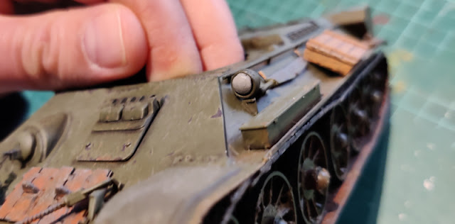
In my earlier models I've consistently painted these driving lights metallic (chrome or steel), if they didn't come with a transparent bit. So for a change I decided to do something else and went with a grey gradient plan. I didn't want to do a strong jeweling effect but something less noticeable than a clear metallic paint or a dark grey bit.

For the base colour I chose my usual grey (VGA 72750 Cold Grey).

With the base drying I mixed some lighter grey (VGA 72749 Stonewall Grey) to the cold grey and painted a small circle to the lower right sector.

I added some more stonewall grey to mix a still lighter shade, and painted a smaller circle into the lower right area of the previous one. To the top left arc I added a tiny line with the same paint.

Finally I poked a pair of an even lighter grey to top the highlights, and plopped the turret in. I was thinking if I still ought to drybrush the top arc with off-white but decided against it, in fear of making a mess.

From this angle it looked lamplike enough to me. Had I been less lazy I'd carved the lamp open and made a lens from transparent thin plastic. I just didn't see that adding much value to the build, so this was good.


Antenna

All that was missing anymore was the antenna that got accidentally knocked off sometime earlier. I spent a bit of time looking for a clue for the actual colour of these things, but it didn't seem to be a popular subject for some reason. Dark grey was good for me, I didn't repaint it and just glued it on again.


For the statistics: the last one was the 198th photo for this project, but I hadn't shared quite all of them.